First Look at Calibre

Calibre is a cross-platform open-source e-book software. This program is famous because it can do absolutely anything, it is basically your media station for your e-book. I got fed up because there is no good e-book software in Linux, especially for epub format. The best epub reader I found was FBReader
FBReader is kinda weird, it assign tags on itself automatically and I don’t like that behavior. Every time I open something it will adds it to my library and assign tons of tags on the book, I don’t like it. Also the configuration is weird, if I want to change background color I had to use RGB slider, it is terribly inaccurate. At least give me some value that I can put in for accurate color, not some arbitrary slider. Those are some of my problem with FBReader, but it is still a solid program, though. You need to check it out on here.
At this point of writing the article, I haven’t installed it yet. So, we will discover it together.
Installing
Callibre updates so often that it’s discouraged to use apt or compile from the source, they provide installation script from their website instead. I will not type the installation script here because it might change in the future. Here’s the link.
After reading that paragraph, I am worried because I don’t know how to uninstall it. Luckily, this website answer that question.. All you had to do is sudo python /usr/bin/calibre-uninstall, then sudo rm -rf /opt/calibre.
The installation went pretty smooth. I cancel it several times because I have a habit to press ctrl+c, though. The installation script is pretty smart, it could pick up where it left previously so I don’t need to do it all over again.
Exploring The UI

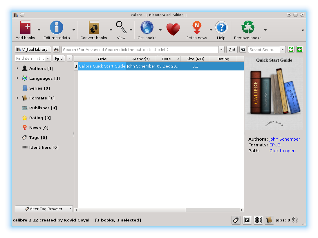
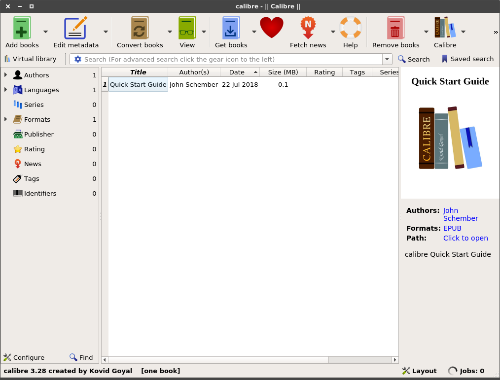
Ahh, the UI felt pretty slick and nice. The one on top of this post is pulled from Wikipedia, the UI now is more flat and modern rather than the one on Wikipedia. I think they made a great job UI-wise. Let’s explore some stuff.
When I open the UI for the first time, my eyes drawn towards the middle, Quick Start Guide. I think I get how it works, kind of.
- The middle part is my book list, it looks like e-mail software haha. Double-click at the title will pop-up their own E-Book reader.
- The right sidebar is the information about the selected book, there is the author name, the file format, and I can open the folder from here too! it will open it with my default file manager (in my case, Thunar). I think it’s pretty handy as a quick overview. Also clicking the author name will open Goodreads in your browser.
- The left sidebar is the categories, I still don’t understand how it works, it will not just list the books matching the categories, but there is also some
<categories>:trueor<categories>:false. That’s still mystery for me. - The top part is the tool bar where I can access its features with clicks on the big icons.
- The bottom bar is the miscellaneous stuff like the changelog, layout config, etc. The Layout button is pretty handy, I could disable some features if I don’t need it clutter my screen. I still don’t know what Jobs do, though.
Trying Their E-Book Viewer

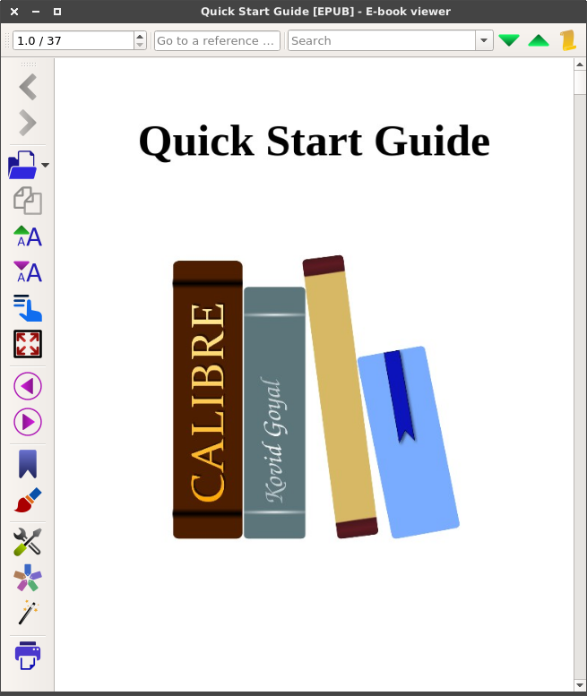
At first glance, I think it’s a great design that they put the toolbar on the left side, vertical space is needed in reading so I think it’s a great idea that they put it on the side to avoid making reading space smaller.
On the top bar there is a small search bar. I don’t think this is necessary, though. We should’ve spawn the search bar with ctrl+f instead of something that’s permanently up there. That’s just my opinion, though. But I could be wrong, they’ve been improving this software for years so I think that decision is the best? I don’t know, let’s just use it and see if I use that feature frequently.
On the rightmost part of the search bar, there is a button that can be toggled to switch the reading mode from paged mode to flow mode. In paged mode, if you press down or scroll, the page will change completely as if you pressed PgDn. In flow mode, you will have infinite scroll as if you’re reading a book. But, this is one of the thing that made me switch from FBReader, the flow mode isn’t really seamless flow. Look at me trying to scroll and read here. I hope there is a way to fix this in Calibre because I switched from FBReader to Calibre for this. I’m gonna be right back continuing this article when I fixed this problem, there is no point continuing it if my switch is meaningless.
I just come back after several days fixing the problem. I think there is no way to change that behavior. I guess I just have to deal with it, for now. I hope Calibre could fix the second problem which is the auto-tag system.